
There is so much information being forced into my head. I’d tell you if I hated it but, the thing is, I don’t. “School” is amazing. I’ve never laughed this much in a long time; I wonder if our instructor moonlights as a stand-up comic.
Our project for week two was to build a multi-page site. Very straightforward. I, however, decided to try out an idea I’d heard and read about—mobile-first styling.
I had a really hard time with this because designing for the desktop is the first and only thing I’d ever done. I would often forget that I was designing for smaller screens and completely screw up my layout. But I pressed on.
Responsive design is implemented in sites so that they display properly on any device with a browser. Generally, a (good) responsive site will not require visitors to zoom in/out, scroll horizontally, tilt their heads, and/or squint in order to view its content. When it comes to desktop devices, there is usually quite a bit of real estate with which to work, so there shouldn’t ever be any of the same issues that mobile users face.
When I first heard about it, I didn’t think much of it. But then I learned about performance concerns (loading time, in particular) and our increasingly short attention spans, and then the mobile-first approach made (increasingly) more sense to me.
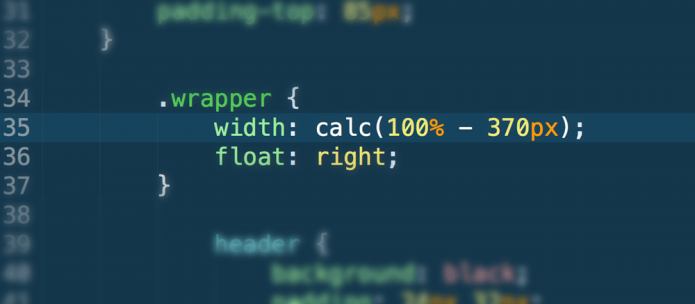
Our CSS is leaner
Since desktops are such large canvases for sites, there’s a ton of complex things that could be done in terms of style. On smaller devices, element styles are much more simple; this usually means optimizing the use of precious space by reducing the number of columns, giving elements a full width and stacking them on top of one another.
Because mobile layouts are simpler, fewer selectors (and with those, properties and values) are required. As the browser size increases, styles can be added as required to jazz up the layout. This is in contrast with “desktop-first” design, where styling must be un-set and/or stripped away as browser space decreases. Because desktop layouts are for the most part more complex, it could take quite a few lines of code to reset the look of our elements for mobile.
Consistency
Believe it or not, there are sites out there that hide content because you happen to be visiting on a smaller device. Why aren’t you able to view the same amount of content as a desktop user? It’s because your device is too small, and those things were too hard to fit on such a small screen. It’s your fault.
Kidding!
It’s not your fault; device display size and/or performance is not a good reason to hide content from users. Mobile-first design isn’t only about looks. The mobile-first philosophy encourages you to evaluate your content to determine whether or not it’s worthy of existing on your site. Because your mobile content is nice and lean and streamlined, the desktop incarnation will inherit that as well.
Shorter load time
If you have a mobile device and use it to browse the web, it’s safe to say your connection isn’t ever as fast as if you were browsing on a desktop. Since we’ve gone through our content and kept only the important stuff, and since we have less code, our site load time is reduced. Less fluff = less work = less code = less styling = shorter load time = less banging head against wall = better quality of life.
Consider the mobile layout your base. Since your base content is consistent on all devices thanks to the mobile-first approach, it’s now cool to add bells and whistles for larger screens because those are just enhancements.
Learn more about mobile-first design at:
LukeW
Brad Frost Web
Project two can be viewed here. Images and copy are not mine.


 Keeping up with the times