This past week was great; I met my classmates and learned about their unique backgrounds. We got a refresher on basic HTML and CSS, learned about personal branding, and even bought hosting for our future sites. Our instructor, Wes, is a very funny man. And the environment in general is pretty cool. It really doesn’t feel like school.
With week 1 all wrapped up, I can tell you I learned two big things: 1) I need to start using social media more often and with purpose—not just for retweeting Seinfeld quotes, and 2) the magical CSS calc() value.
We’ve been encouraged to use relative units (percentage, em, etc) to define the dimensions—especially the widths—of our elements (vertical scrolling is cool, horizontal scrolling not so much), and it makes sense to use dynamic values to style things that’ll be viewed on screens with unknown dimensions and proportions.
With that said, I was faced with a challenge while completing our first week’s assignment of building a one-page site. In my header, there is a h1 of fixed width (ie. the content here will never change), and to the right of it is my nav. I want the left edge of my content to align with the left edge of my nav, and I want my background image to be exposed in the empty area directly underneath h1.
I’m sure there are other ways to solve this; but I can be stubborn at times and I wanted my one-pager to look exactly the way I wanted it to look. No compromises for this guy.
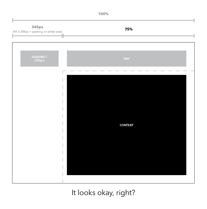
If I assign my content wrapper a width of, say, 75% (pictured above), it looks great.
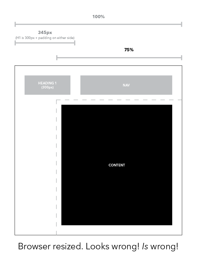
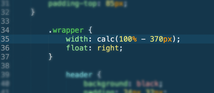
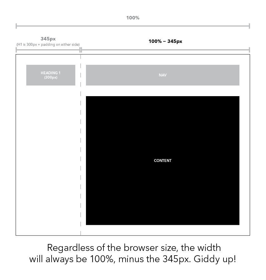
But what if I shrink the browser window (pictured above)? The content spills out into the space underneath h1 and it is no longer aligned with my nav and the layout is broken. That’s a shame. Essentially, the layout will look perfect only when the browser is a certain width, and that is ridiculous. I needed to mix a relative value with an absolute one. I had to make my content wrapper span the full width of the browser (100%), and then pull it back by subtracting the width of h1 and its surrounding padding (345px). Could it be done?
You bet!
I guess it could be said that calc() is a relative, or dynamic, value; its computed value is calculated on the fly as variables (such as browser width) change.
.content-wrapper {
	width: calc(100% - 345px);
}
calc() can be used whenever a number-based value is required. It can handle addition, subtraction, multiplication, and division. It’s got pretty good browser support, too.
Learn more about calc() at:
Can I Use
Mozilla Developer Network
CSS-Tricks
The finished product of my roommate’s site can be viewed here.
 Keeping up with the times
Whoops – I meant to leave my comment on this post… Very well written Nathan, and very helpful! Thanks for posting 🙂